Points Friend
Introduction:
Traveling has always been one of the most enriching things throughout my life, and I believe that this sentiment is one that I share with everyone. However, as a younger person with less disposable income or savings, it is more difficult to afford travel while keeping up with other financial responsibilities. Travel can undoubtedly be expensive, but one common way that people save for travel is through the use of travel cards where people save their rewards points that they acquire through daily spending. Travel cards and rewards points are very valuable assets that help people afford travel, but getting the most value out of your cards and points can be a stressful and complicated process. Learning this led me to exploring this problem space of making travel more accessible, and researching different methods of extracting the most value possible from travel cards and rewards points.
Problem Space:
Traveling should be a relaxing and fun time, but this is not always the case. In fact, planning and acquiring funds for travel is commonly a stressful experience for many people, including myself. This can be especially true for younger people who are more budget-constrained. Knowing this, I wanted to help people accumulate rewards points and maximize the redemption value of those points, because traveling and experiencing different places, cultures, and food is an invaluable experience that helps people grow. With this goal in mind, I set out to think about solutions to help people travel more and explore the world.
The Solution:
Considering that there are already consolidated travel booking apps and websites available such as Expedia and Kayak, the travel booking platform space is already heavily saturated, so Points Friend will not be focusing on this space. Instead, Points Friend was positioned as a planning and research tool to assist travelers with the accumulation of their rewards points, and helping them maximize the redemption value of those points, so that they can travel more often and for longer periods of time.
My role:
Throughout this entire project of designing Points Friend, I worked as a one man team while getting feedback from UX/UI Design industry professionals who served as my mentors. End-to-end, from initial research, ideation, prototyping, testing, and iteration, I have created all of the research documents, personas, empathy maps, wireframes, and high fidelity prototypes.
Key Phases:
Initial Research:
To understand the problem space better, I conducted secondary research on travel cards and rewards points systems. This secondary research confirmed my assumption that people found it difficult to maximize the value from travel cards and points. One particular area where people struggled the most was transfer partners.
As seen from the image above, you are able to transfer your rewards points to various airlines and hotels that are partnered with your travel card. However, the transfer ratios of points are not always 1:1, and airlines and hotels have different pricing models, so it is often difficult to know when and where to transfer your points to get the most value out of them.
This can become even more complicated when you factor in the limited-time quarterly or yearly transfer bonuses that are offered by travel card transfer partners. As seen in the image below, transfer partners sometimes have bonuses when you choose to transfer your points to them. This turns 100,000 points to 130,000 or 140,000 depending on the bonus rate being offered.
Taking advantage of these transfer partners is often the key to maximizing the value of your points, but researching and planning while keeping track of transfer bonuses feels like a disconnected and clunky process. You have to search for the points rate of all transfer airlines and then keep in mind transfer ratios, but this entire process creates friction for travelers because this is a lot of work they have to do before they can relax and enjoy their travel plans.
I furthered my research by conducting interviews of potential users that own a travel card so that I could learn their wants and needs and sympathize with their pain points. From the insights gathered from these interviews, I created an affinity diagram, personas, and an empathy map that you can see below. These design artifacts were created to inform my design decisions for the prototyping phase. See below for screenshots of these artifacts.
Affinity Diagram:
Interviewing travelers allowed me to learn about their travel habits, knowledge, and research styles. Additionally, I learned about which travel benefits are most important to them. These insights informed my design decisions for prototyping, and gave me inspiration for features to build.
Persona:
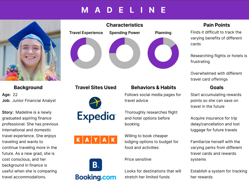
The primary user group that I kept in mind for Points Friend was young professionals aged 22-30 who enjoy travel, but are more budget constrained than older people who have more disposable income. This led me to creating Madeline’s persona which you can see above. Points friend is targeting younger users who are looking for ways to stretch their budget and get more from the money they spend traveling. This younger user group is also more comfortable with utilizing new tools that assist in travel planning and emulates the same experience they would get from following a social media page that posts “travel hacks” to save money and help people travel more frequently and for longer periods of time.
Empathy Map:
Keeping in mind Madeline’s persona from above, I applied this to make an empathy map to help me further sympathize with her needs. Through reviewing interview recordings, I listed the most important insights gathered and consolidated them on the above empathy map to understand what users say, feel, think, and do when they are traveling or planning for travel.
Ideation:
After conducting the initial research, it was then time to start ideating for solutions. This led me to create the following document:
This short document outlines my “How Might We” problem statements and my initial ideas for solutions and features to be included in Points Friend.
Then, after creating these initial solution ideas, I created user stories to outline what users are looking to accomplish within Points Friend. These user stories are attached below.
At this stage, my idea was to create a consolidated solution that allows users to maximize points earned and points redemption value, as well as allowing them to create flight itineraries and search for flights, hotels, and cars. Keeping this in mind, the MVP user stories were prioritized by key functionalities like login/sign-up, adding travel cards and viewing benefits, and creating itineraries to summarize their travel plans and show users total costs.
After creating user stories, I moved on to creating flow charts for the red routes included in my MVP. Screenshots are included below.
Here is a link to view the flow charts better.
Prototyping:
After synthesizing all of the insights gained from research, I moved on to creating a paper prototype. You can see some screenshots of this below.
Paper Prototype:
After creating the paper prototype, I tested it with more users to get feedback before moving on to building wireframes and the high fidelity prototype. A guerilla usability test was done to test for any navigation issues and making sure that users could successfully navigate to the main features of Points Friend. After this, I moved on to creating wireframes.
Wireframes:
During the wireframing phase of this project, I was receiving constant feedback from my mentors about my design. We worked together to brainstorm ideas about different edge cases that I may have missed while I was designing wireframes, and I used my mentor's feedback to continue iterating until I arrived at the above screenshots. From this point, I moved forward to creating high fidelity prototypes.
High fidelity prototype:
Here is a link for you to try out my high fidelity prototype. My high fidelity prototype uses components from material design, and I chose Roboto for the font as it is the default font for Android. For Points Friend, I designed the app with a dark mode interface using neutral colors so that the users could have a simple user experience and focus on the features, imagery, and functionality of the app.
Testing and Iteration:
After creating the initial high fidelity prototype, I ran two rounds of usability testing, and iterated my design based on user feedback. For these two rounds of usability testing, I was focused on taking the users through 3 task flows: login/sign-up, adding a card and viewing benefits, and creating/viewing an itinerary.
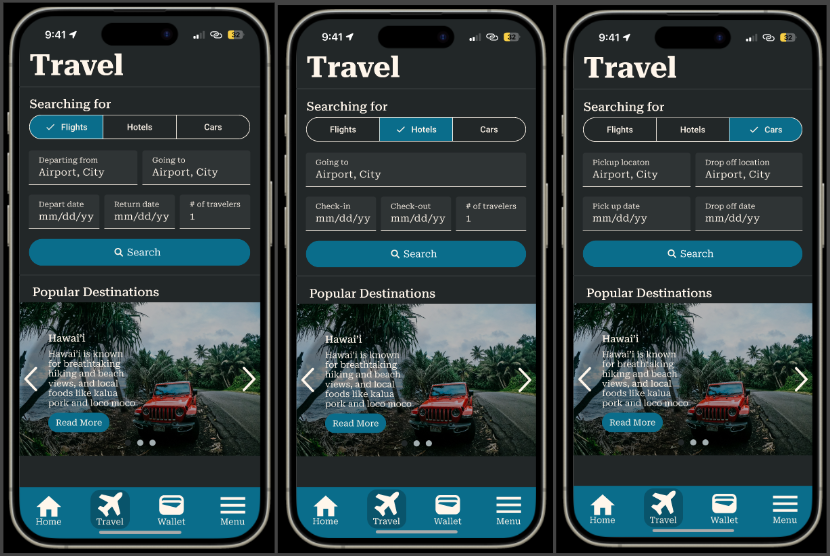
After the first round of usability testing, I added more functionality to the search feature to allow users to search for flights, hotels, and cars, and I made the segmented button functional. I also added a return flight selection as I had originally missed that in the initial prototype. Screenshots below show the iterated functionality of the segmented button.
After the second round of usability testing, I added more transfer partner information so that users could be more informed about where their points could be used and which transfer partners have more advantageous transfer ratios. Also, check-in and check-out time was added to the itinerary summary for hotels, as well as pick-up and drop-off times being added for rental cars. These changes were made after receiving feedback from the users that they wanted more information about transfer partners, and they wanted other useful information within the itinerary summary so they could have that information at a glance. Screenshots of these changes added below.
Reflection and Learnings:
After the completion of this project, three main takeaways were the importance of feedback (whether from users or mentors), constant but incremental improvements, and data driven design decisions. Being my first major design project, Points Friend was a labor of love. I learned how to use figma for wireframing and creating high fidelity prototypes, which was no easy feat for my first project, but it was definitely a worthwhile and rewarding experience. Additionally, interacting with users for interviews and conducting my own secondary research, competitive analysis, and usability testing throughout the design process proved to be essential to create the solution that users needed to solve their problems and create a better user experience for Points Friend. As a recent graduate with my degree in management information systems, I was more familiar with data analysis, reporting, and management from my degree. However, this project challenged me to learn design principles like the importance of whitespace, visual hierarchy, and accessibility, and it was a very fun experience all around. For my next projects, I would like to experiment with bolder and more vibrant colors, while still keeping in mind the design principles that reduce friction and create user-centric products.


