CityPup Design Sprint
Introduction:
For my second UI/UX design project for Springboard, I was tasked with following the structure of a GV Design Sprint where I learned how to quickly synthesize research and create an MVP that I could test with potential users. For this project, I chose the project prompt for CityPups from Bitesize UX. In summary, this prompted me to create a webpage service that matches people in the city with dogs that meet their needs such as size, weight, space available, and exercise needs.
Day 1 - Map:
I spent the start of Day 1 familiarizing myself with the prompt and research given to me by Bitesize UX. This included understanding the unique considerations that people have when living in the city while trying to adopt a dog, for example: indoor/outdoor space, schedules, transportation, commutes, dog temperaments, etc. Additionally, I prioritized and noted the goals of CityPups which were increasing adoption rates, creating better forever homes for dogs, and making dog owners happier. Lastly, I also took into consideration the provided constraints such as designing for desktop/laptop, and focusing only on the process of matching people to dogs rather than the adoption process. Screenshots below show my notes taken from synthesizing the provided research. Provided research includes insights of what potential dog owners look for in a dog when they are looking to adopt, a persona to design for, and a usability test interview with a potential user that took her through the process of searching for a dog in her area that matched her needs of size, space constraints, and calm temperament.

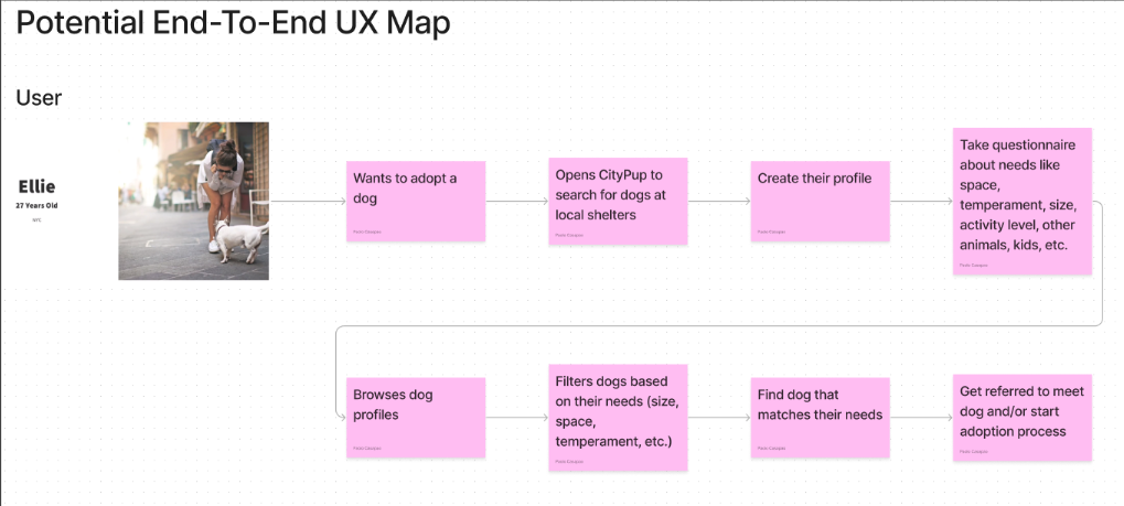
The output for Day 1 of this sprint was to create a potential end-to-end user experience that a user might have with CityPups by making a map that outlines the potential steps a user might have to take in order to get matched with a dog that suits their individual needs. When initially ideating solutions, I thought that a short quiz would eliminate the need for users to navigate through an intricate filtering process to find dogs that matched their preferences, so I went in that direction for this initial UX map for CityPups. A screenshot of this map is included below.
Day 2 - Sketch:
Day 2 was focused on ideating and sketching different potential solutions for CityPups. Before getting started on the ideating and sketching process, I conducted a solo version of lighting demos where I looked at existing solutions of competitors that also matched people with dogs that met people’s city-living requirements. This lightning demo exercise was used as inspiration for sketching potential solutions for CityPups. Screenshots are attached below of this lightning demo exercise.

Upon conducting this lightning demos exercise, I learned that the two main solutions that competitors used were a quiz (like I originally thought of on Day 1) and an advanced filtering process (which I was looking to avoid to simplify the user experience).
Moving on to ideating and sketching solutions, the next exercise for Day 2 of the sprint was a Crazy 8s Sketch exercise where I sketched different variations of my most critical screen. For CityPups, I determined the most critical screen to be the screen where users were scrolling through the dogs they were matched with based on their preferences, because this screen leads to the user clicking on a dog they are interested in to see more information and potentially start the adoption process. A screenshot is included below of my sketches for this exercise.

When I was doing the Crazy 8s sketching exercise, I stuck with the idea of using cards because they would allow me to include pictures of the dogs and some of the more important information that would help the user get interested enough to click through to a dogs profile. I took some inspiration from the lightning demos that I conducted before this because the cards from those solutions did a good job of packing a lot of relevant information into a condensed space to help people find dogs that suit their needs.
The last exercise for Day 2 was to select one of the solutions from the Crazy 8s that was the best solution, and to create a 3 panel board of the screen that comes before it, the critical screen itself, and the screen that comes after. A screenshot is attached below of my sketches for this exercise.

For this 3 panel board, I included the quiz that would help identify a user’s unique needs for their dog, the chosen Crazy 8s sketch, and the dog profile screen which would include more information to help users know if that dog is a good fit for their home.
Day 3 & 4 - Storyboarding & Prototyping:
For Day 3 and 4, the main focus was fully fleshing out my solution and creating a higher fidelity prototype. I am combining these two days because the suggestion from Springboard was to use PowerPoint and create a low-fidelity prototype that would be just enough to validate the solution concept, but I wanted to challenge myself to improve my design and prototyping skills in Figma, so I chose to move on to high-fidelity prototyping in Figma instead. This decision was not taken lightly, but I really wanted to focus on improving my skills so I was all in on moving my solution to Figma at this point. Given the limited time frame, I decided to also make use of material design components to help me speed up my design process, rather than doing everything from scratch.

The landing page was aimed towards getting people to search for dogs near their zip code, so most of the screen space was devoted to the call to action text prompt and button. Following that, users were moved to the quiz screen which gauged their individual needs of size, age, space constraints, exercise needs, etc. Then, the following screen showcased matching dogs that met their criteria in or near their area code. For this screen vertical format cards were used rather than the cards from Day 2 that I had originally picked, because this format created better balance on the screen which helps users more naturally browse through the dogs. The last screen created is the profile screen where they could see more detailed information about the dog users are interested in. This screen included more photos, a bio that showcased the dog’s personality and temperament, and health information like if the dog was neutered/spayed, vaccination status, known allergies, and other relevant information. All of the information included was based on the research provided from Bitesize UX that I showcased within the Day 1 section above, so I focused on the needs and pain points mentioned within that research such as temperament, space, exercise needs, and size to name a few.
Day 5 - Test:
Day 5 of the sprint was focused on testing and validating this concept with potential users. As time was limited during this sprint, the high-fidelity prototype on Figma was created to be taken through a specific user flow within specific constraints that would still allow me to validate the concept. Users were given a prompt to search for dogs in my area code (95112) and look for a large, young dog. A screenshot is included below that was taken during the debrief portion of the test with a potential user when I was thanking them for his time.

I conducted this testing with 5 users who live in the city and would like to, or currently own, dog(s). The testing was conducted on Zoom and participants were asked to share their screen while completing the tasks that I gave them. After completing the testing, the sentiment from all the test participants was that the concept of CityPups worked and the User Experience made sense to them end-to-end. Validating my concept/solution was a great feeling, but I also asked for general feedback on if they liked the UI and things they thought could be improved.
The main insights I got from the debrief portion of the testing sessions were:
Users liked the simplicity of the user interface and they liked that nothing was overly complicated
Users liked the color scheme and they thought that everything “worked well”
Users wanted a bit more control and would have loved to be able to narrow down their matches based on specific breeds
Users wanted to be able to widen or narrow their search radius from their chosen zip code
Overall, the testing session went well and users responded well to my solution for CityPups, but there is always room for improvement. The debrief sessions gave me some insights on what users liked, and some other things that I may have missed or did not add due to the short time frame for the sprint.
Conclusion:
This 5 day design sprint was a great way to challenge myself to work within a short time constraint to create an MVP that could be validated with users and iterated on in the future. Working within the time constraints really challenged me to make many tradeoffs and decide what would be the most important to include within the MVP to test my solution concept. I feel that this sprint has helped me grow as a designer, not only because of the time constraint, but also working within the bounds of the prompt given to me by Bitesize UX and considering the existing research that was provided. This really helped me emulate working at a company within a team where research was done by other team members. Additionally, challenging myself to make the prototype on Figma was difficult and took more time than if I were to do a low-fidelity prototype on PowerPoint like Springboard suggested, but it was a worthwhile experience and I feel that it helped me become more comfortable with my design tool.